Can anyone explain the graph in the app for the climate sensors? No sure if it’s temp or humidity on the main screen graph and it doesn’t seem to make any sense for either of them. In these 2 screenshots the temp stays the same but the humidity goes down yet the graph goes up. So what is the graph representing?

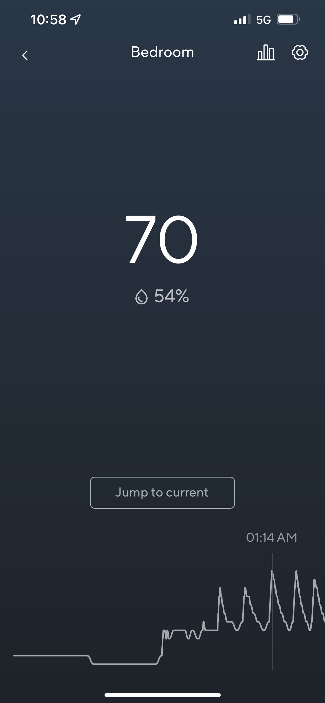
I believe it is representing the Temperature. If you click on the Graph Symbol at the top next to the settings icon you will see the graph in detail which is temperature.

